5 tricks to create a good profile that only the best will know: 

A profile is one of the main concepts to know and master when talking about colour management. If you want to print accurate colours and get the most out of your colour output devices, you need to know the steps to get the best possible profile.

To start talking about profiles, we need to have the concept clear. So let’s go with a definition: 

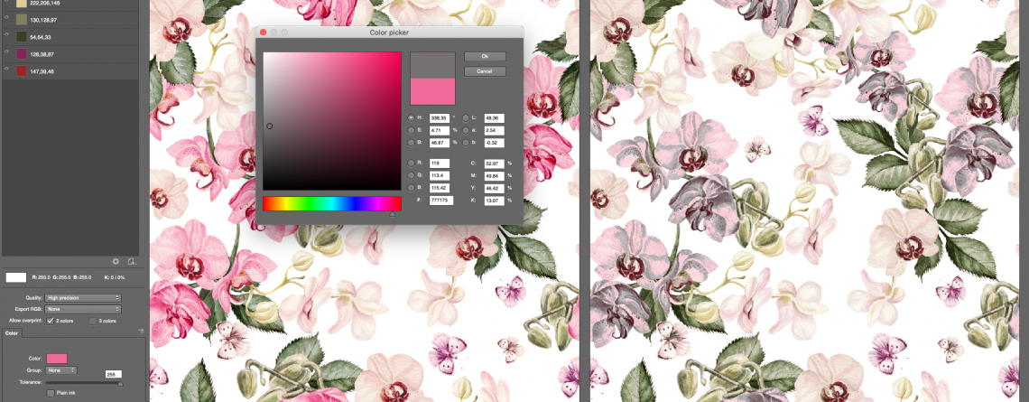
A profile is a file that contains the colour information that can be interpreted by a device, either input (like a scanner or digital camera) or output (like a printer or screen). 

It is necessary to have two profiles: a standard one and the printer itself since the final profile will be created from a mathematical relation between the standard colour space (the input one) and the capacity of the device to interpret it. 

In this article, we will focus on the creation of profiles for digital printers. 


Introduction to the creation of profiles: 

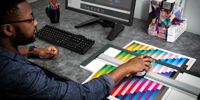
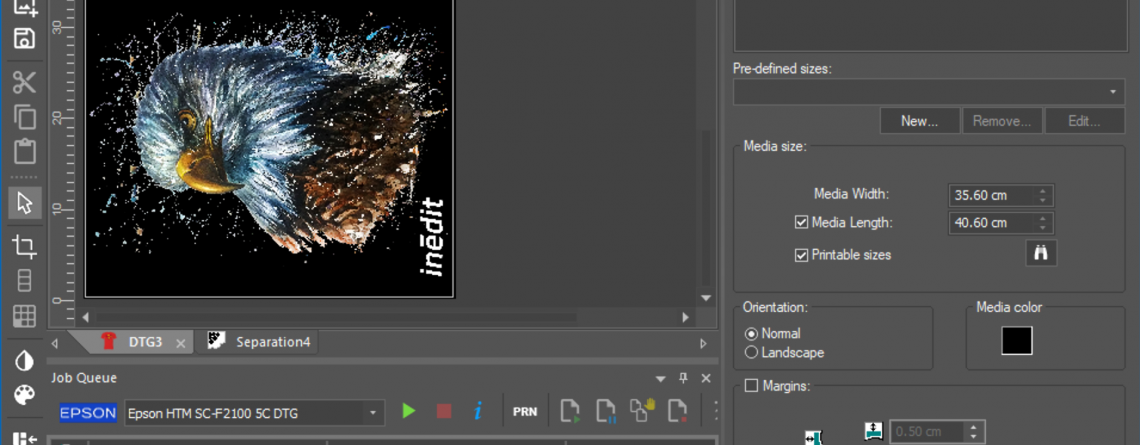
To create a profile you will need to have some tools with you: a good Rip Software to help you interpret the capacity of your printer, a colour measurement device (spectrophotometer), the output device (The digital printer in this case), and other material needed (For example paper, fabric, plate, etc.)

In addition, we need to know which media you are going to use. If you are going to print on paper, the calibration and the consequent creation of the profile will be much easier, since only one material is involved in the process. 

If, on the other hand, we want to create a dye-sublimation profile, we have to take into account the tools that come into play: the plate, the fabric, the dye-sublimation paper, etc. so it is more complicated to create a stable profile. 


5 tips to create the best profiles: 

Now that we understand the concept of a print profile, we would like to share 5 tips that our technicians apply in order to obtain the best results: 

1.Create the profile using the final production conditions: It is important to understand that the process of creating a new profile aims to obtain the best colour results in the final productions. For this reason, it is necessary to reproduce the same printing conditions that we will use at the moment of truth. We do not recommend using cheaper paper or fabrics for calibration or using an iron instead of a calendar. With this, we only will obtain non-expected results. 

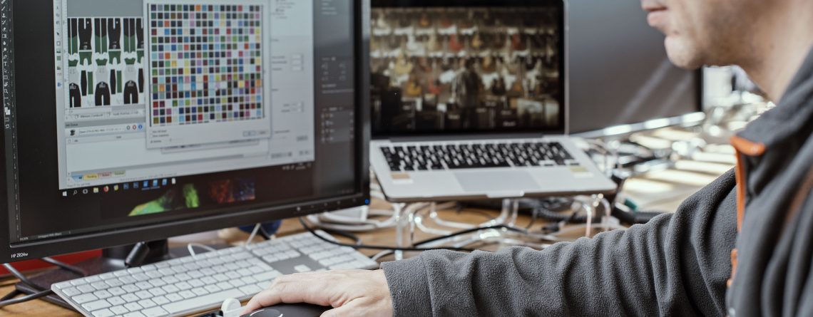
2. Work with Rip Software that facilitates the creation of the profile: It is very important to work with software that can understand the colour interpretation capacity of your printer, but it is also very necessary that the Rip Software facilitates the process of creating your profile. To do this, we recommend, first of all, that the Rip has a calibration wizard that guides you through this process step by step. 

3. Read, read and read: If you have ever worked with us or attended one of our courses you will know that there is a motto that we do always repeat: Read with the spectrophotometer three times. This way you will get three different colour results, which you can compare and get an average of the colour that will be the closest to the printing possibilities of your machine. 

4. Keep the printing devices in good condition: Check that at the time of creating the profile all the equipment involved in printing is in good condition and correctly configured. 

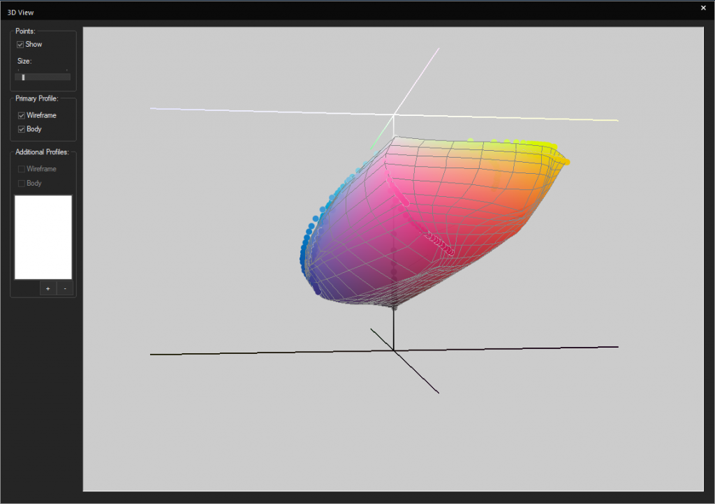
5. Profile and re-profile: We also recommend checking the printing results periodically and, if necessary, re-creating the profile. In neoStampa we have the option of re-profiling, which will allow you to analyse what has changed in your printer in order to adjust the profile again. 

We hope you have enjoyed our post and remember that if you have any doubts, you can contact us directly by writing to sales@inedit.com
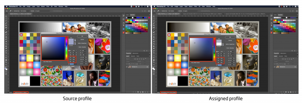
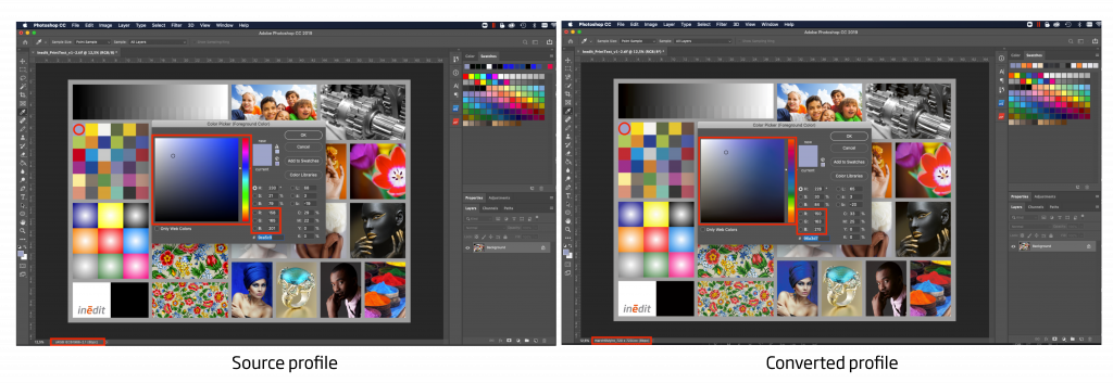
Read more...

Design in RGB for better print results

Designing in RGB for printing is possible.

One of the first decisions we will have to face in the design process for printing will be the color method we want to use: CMYK or RGB. There is a general belief that we should work in RGB for designs that are going to be seen on a screen, while the CMYK method is for physical prints. Today in Inèdit’s blog we are going to dismantle this myth:

A bit of theory: CMYK vs RGB

The CMYK color model focuses on four colors: Cyan (C), Magenta (M), Yellow (Y) and Black (K). With CMYK we use the Subtractive method, by which colors are superimposed on the print to create the desired result. The absence of color will be white while 100% of the color black, but in addition, there is the “K” option that will allow us to create this black, with less ink consumption and a more intense color.
RGB is based on the colors Red (R), Green (G) and Blue (B) and works with additive synthesis, which consists of varying the intensity of light in the three main colors to create one again. This means that the more light we add, the brighter the results. So, 100% of light in each color will result in white and, conversely, 0% will result in black. In RGB, by playing with lightness we increase the variety of colors we can create compared to CMYK.

It is true that the vast majority of digital printers and plotters used to work in four-color printing, in other words, with the four colors that make up CMYK, limiting color results, but today this no longer happens.

Continue designing in CMYK?

In the digital printing sector things are changing a lot and color management and reproducibility are becoming more and more important.

Currently, printer manufacturers are focused on offering a greater number of inks, going beyond CMYK, in order to expand the color range of printing and be more competitive in the market.

We can find orange, blue, violet, turquoise, and even fluorescents in the ink options. In addition, the machines are constantly increasing their capacity, reaching to hold 8, 10 or even 12 different inks.
So we ask ourselves, does it make sense to keep working from the design only in CMYK, limiting the colors, when maybe the production printer has a wider color range?

Design in RGB to get the desired color results.
From our point of view, no. By using printers with a wider range of colors and working with all the necessary tools, it will be possible for you to end up printing the colors you see on screen, without having to juggle to imagine how the four CMYK inks will mix at the time of design.

One of the great allies for this color reproduction is the Rip Software you are using. For example, neoStampa is one of the rips that creates your print profiles in RGB. This allows you to have a standard color range, regardless of the number of inks in the printer, and that works in the same language as the designer’s screen or monitor. This way, you keep the color from the design until the final printing and the designer can focus on what really matters, creating with the colors that they like.

Read more...

Why is Adobe Photoshop the best tool on the market for textile design and color management?

Adobe Photoshop: The leading tool in the design

In the last decades, Adobe Photoshop has positioned itself as one of the most important tools in the management of pixel-based images. With Photoshop, not only do we have at our disposal a wide range of tools for editing, transforming, and enhancing images, but you can also access a wide range of customized tools that provide the best results regardless of which industry you work in.

For instance, our sector: is textile design and printing. With the power of Photoshop and the external add-ons, we have in our hands the perfect tool to make our work faster and more efficient.

But do not forget that the job of a textile designer is not over when the design is finished, there are different processes that are necessary and we must ensure their success. One of the most important processes is Color Management.

Color management in textile design and printing

Color management is one of the most popular terms in our industry. Broadly speaking, color management is the process of converting the representation of colors in different devices (for example, converting the color we see on a screen to the one we will see on fabric) to reproduce colors as accurately as possible. When we start a creative process, we imagine shapes accompanied by a color palette. This same palette is the one we reproduce when we design and the one we expect to be printed at the time of production. Furthermore, one of the particularities of the textile sector and in particular digital printing is the repetition of the productions: We launch a collection, produce a print run and if it has succeeded, we produce it again. With good color management, not only will it be possible to print what we have sold but also we will be able to repeat the production as many times as necessary without changing the result.

So why do you need to know about color management if you are a textile designer? Because it is the only way that the colors we imagine in our head, which we later capture in Photoshop, will be the same ones we will see printed in the collection.

Why choose Photoshop for color reproduction?

To the initial question of the post Why is Photoshop the best tool in the market for textile designers? The answer is: Because it is the tool that will best suit your color management needs.

And, how do we do it? Photoshop has four key processes that will help us maintain color accuracy throughout the design and printing process:

  • Allows you to work with embedded profiles: This makes it much easier to work with color management. If we work with an image with an embedded profile, we will see the colors that your output device will be able to reproduce, and we will also be capable of maintaining this information for the production department.
  • Allows you to assign color profiles to your designs (Edit > Assign profile): With this tool, you can change the profile you will work with. We will change the initial profile of the image for the one we select. In this process, the RGB coding is maintained but the colors will be changed since the color profiles are responsible for giving the values to the RGB. If these are different, the colors will change to fit the selected profile.

  • It has the functions to convert (Edit>Convert to profile) and test a profile (View>Test Fit): The difference between assigning and converting a profile, is that the latter, when we select a profile for change, will not maintain the RGB coding, trying to preserve the color results as much as possible within the profile. The function of testing a profile is very similar to that of converting the profile, but it simply shows it in Photoshop, without modifying the image. This way, we can simulate the output colors of the job. The function of testing a profile is very similar to that of converting the profile, but it does not modify the image, it simply displays a preview of the results in Photoshop. This way, we can simulate the output colors of the work. If we use both tools at the same time, we will have our design prepared with the profile we want to use and, in addition, we will be able to see the simulation once printed on paper or fabric

  • You will be able to send a file to be printed preserving the color management previously done: Finally, the same tool, as we have mentioned before, will allow you to send all the information about the image and the profile to the production department, so as not to lose any information of our work.

If you want to know a little more about it, you can watch this webinar where Gerard explains in detail the steps to follow for color management with Adobe Photoshop®. If you have any comments or questions, you can write to sales@inedit.com

Read more...

Introduction to color management with Adobe® Photoshop

Adobe® Photoshop® is one of the main tools used for textile printing designers. But how should we manage color so that our textile design can be reproduced accurately?

In this Webinar, you will discover the answer to questions such as:

Why do we need Adobe® Photoshop® to print colors precisely?
How to use color modes?
What is a color profile and how to use it?
How to work in RGB mode?

Click on the video and enter the world of color management for textile design:


Read more...

Inèdit Software presents neoStampa Delta, featuring a DTG mode and a new PDF print engine.

The new release of Rip Software will feature a new engine for faster and more accurate PDF printing, a specific mode for DTG and  performance and color reproduction improvements.

Barcelona, November 9th 2020

On November 4th, Inèdit Software presented the new version of neoStampa Delta. They did it from a virtual event where the same creators of the software and several collaborators exposed the news of Rip Software, which aims to be a revolution in the digital printing sector. 

Until now, neoStampa has been the reference Rip Software in digital textile printing, especially for the most demanding ones with color reproduction, achieving the maximum potential of their printers. With the Delta version, the company intends to go one step further and extend the scope of neoStampa to other sectors such as sports printing, film, ceramics or DTG printing. 

One of the main new features of neoStampa is the incorporation of a new PDF engine, the Mako® system from Global Graphics®, which enables any PDF/X standard file to be replicated, guaranteeing consistent results. In addition, we can see an improvement in performance, printing up to 5 times faster. 

The incorporation of an improved PDF engine will allow the Rip Software to be for the first time a perfect option for sectors such as sports design printing, advertising graphics printing, ceramics, film, among many others. 

On the other hand, neoStampa Delta also includes the new DTG printing mode with which it will not only be possible to print directly to garment with better color results, but also to save up to 50% of white ink. neoStampa Delta includes a calibration wizard in just two steps and also a new white base adjustment under semi-transparent areas, which will allow  the savings mentioned above. 

Finally, neoStampa Delta has a new cost control system with which it will be possible to track jobs in real time, knowing the meters printed, the speed and the ink consumption, of all printers. 

With the incorporation of all these innovations, Inèdit Software offers to the digital printing market a versatile version, with a multitude of applications, in order to obtain the best color reproduction of each print. neoStampa is compatible with more than 700 digital printers and every month they are offering new compatibilities to the market. 

Inèdit Software has not yet revealed the release date of neoStampa Delta, however all the information is already available on its website, and there are also different ways of contacting those who want to try the software for free. 

More information: https://www.inedit.com/en/neostampa-delta/

Read more...

Q&A Session: All the answers, without secrets!

To contribute to the quarantine, we organized a Q&A live session with our experts. Our customers had the opportunity to ask us all their questions and we answered. Would you like to learn a little bit deeper about color management and textile design? Keep reading and discover all our secrets! 


neoStampa and Color Management:

1. What do you think is the default lighting condition in textile printing to judge color? D50 or D65?

D65 in textile, D50 in graphic art. Usually, We use the D65 as standard, but the condition must be set according to the user ambient light standard or according to Lightbox they’re using.

2. Is it possible to print not to a printer but to a lab tiff file export?

It depends on the neoStampa connection to the printer. There are machines that require multi-tiff files to print. For example, a Reggiani Machine has its own machine software, therefore neoStampa would send a series of tiff files with the color management already done to the machine. Once the files reach the printer, the operator simply has to choose the number of copies to print.

3. As RGB is a bigger color space than CMYK, does monitor profiling really helps? If yes, how?

When we calibrate a monitor, we usually have a huge profile from the Monitor vs a smaller profile from the printer. What we do is to install the printing profile on software like Photoshop, which allows us to use a proofing tool to see the printer colors on the screen. In order to do that we need also a calibrated proofing monitor in order to match colors and see the best results in it.

It does help if you use the real printer profile in Photoshop. Usual Adobe RGB  or sRGB profiles are bigger than the printer profile, therefore you should limit the color possibilities you see on the screen. In

neoStampa the extra colors are included in the profile, it doesn’t matter if your printer is CMYK or CMYK+RGB, the profile creation process is the same and the color gamut size will depend on the number of colors, the paper/fabric used and the type of inks.

4. I’d like to know the “optimal” workflow for printing with fluorescent spot colors. Can I prepare the file in Photoshop and print directly or do I need to manage the spot colors through the neoStampa?

Although there is an automatic option to create a fluorescent, we are aware that some time you would need to work in spots.  So you have 2 options:

  1. We have the possibility to do it in Photoshop, preparing the file using Alpha Channels, and then replace them with fluorescent ink. We can also do it in Illustrator.
  2. Calibrate the machines with neoStampa using fluor colors and print an image. neoStampa will decide automatically where to apply the fluorescent

5. Iccmax is using a spectral light source and not only D50?

In neoStampa we use always a spectrophotometer to measure and we save all the data, not only D65. You can also consult the spectral curve and switch from D50 to D65.

When we measure the Colors with a spectrophotometer we get the spectral data while old colorimeters only get the color information. So we save all the spectrum of the light. Sometimes when you select one light you also get the color information, in only that light. In Spectro, you can choose any light you are using. With neoStampa, we work with all this information because we save the spectral data of the device and we are able to work with it.

6. Does neoMatch correct RGB values or spot colors?

neoMatch works with the printer profile. So, we measure the color, we print it and we measure again. With this process, we can see the differences and correct RGB values. This is the main idea of neoMatch. After that, if we find a difference, neoMatch automatically reprint colors and try to correct these differences. So we can create almost identical copies of the original library. After that, when we get the best precision, we can also consult the delta E, have an estimated number colors that we could get, which ones we can improve, etc., So the answer is yes, we correct the RGB values but we also have a function inside neoStampa that allows us to replace this to Spot Colors, correcting both values.

7. What is the connection between neoStampa and neoMatch?

When we correct a library,  we can export it and upload to neoStampa such that when neoStampa receive a color, it doesn’t matter if its an RGB color (the original) or a Spot Color (For example, colors from a library of illustrator or Photoshop with an own name) the software will recognize it and will find the color on the library you created in neoMatch. Everything will be done automatically.

8. Is possible to create a paper sample and then print the same on the fabric?

A Proofing paper machine should be able to simulate the same colors like a digital printer. With neoStampa we have a tool that allows understanding the two-color profiles to be equal.

11. It is always necessary to read 3 times the patches when generating the ICC??

We recommend it 100%. Measurements are the basis of all we do. If you read only once, you might be introducing errors -measurement error or from the printout itself-. If we want to reproduce a color later is essential.

12. I would like to have more information about the option of checking the consistency of the profile and re-profiling.

When we re-profile, we print a small chart which is a selection of colors from a larger profile, the same we have been using during calibration. That’s useful to compare if the printer is still printing the same then it used to do previously. So,  we compare the results of the measurement with the original one. As a result, it is very easy to see if there has been a change of the color printed and the stability within the time. It allows us to analyze if we are printing the same or not and if it is worthwhile to do a profile again.

13. How does the Print Server work?

The print server is a queue outside the neoStampa. It’s faster and can also be connected to other softwares. Therefore, it can be linked with all Inèdit programs. Furthermore, from a Tablet, entering the IP of the machine, you could see the queue of your Print Servers, control the machines and all the jobs of your company.

14. You recommend working with CMYK profiles embedded from Adobe Photoshop or only the ICC that is made in neostampa?

We recommend working with the one from neoStampa if you want to see the same colors that you will be able to print. If you work with Adobe’s, the colors may be different. Even though, when you transform a file that you have worked with a CMYK embedded, neoStampa will read the colors and reproduce them as well as it can.

15. I’ve always seen that Neostampa is a specialist in fashion designs but in vector designs, it gets a little complicated, is that so?

We understand that for Fashion Design you mean pixel images. Not that complicated: vectorial designs (such as PDF, illustrator, EPS, etc.) have many different visualization options and when it comes to neoStampa we cannot know what type of option you had selected in your editing software. This is the main problem. In Illustrator, for PDFs there’s a more restrictive system, called PDF/X-1a that restricts all these variables much more, trying to ensure that there are no errors of interpretation. In an image created with Photoshop, for example, the image is created pixel by pixel with the information of each pixel so that it is easier to interpret by neoStampa.

16. Assigning the profile from Illustrator requires a parameterization at the time of export?

If you work with profiles in Illustrator, when you have an embedded profile, you have to make sure that the option to include embedded profiles when exporting is activated.


neoTextil and Workflow Management:

1. I work in the building materials industry, plaster, and cement-based surfaces. We have already NeoStampa, how can we use the ICC profiles in photoshop?

When we make calibration with neoStampa it contains also a profile. A profile is a space where we can find, exactly, all the colors that our printer is able to reproduce. Once created, you can export this profile, install it in your computer and use it in Photoshop. So, finally, you will know exactly the colors that you can reproduce and you could see in the screen the same colors you will print. So the benefits are:

  • You will see, while you are creating a new design, exactly the colors that you will print afterward.
  • And you make sure that the colors you are exporting are the ones that will be printed, without losing information during the processes.
  • If this profile is installed in all the computers of your companies, everyone will be able to see exactly the same colors, avoiding color misunderstandings before and after printing.

2. Can you explain how to use Multicomia for silk screen:

In neoTextil we have two separations modules: nT Masquerade and nT Multicomia. nT Masquerade is more focused on Digital Printing, because its easier, intuitive and automatic and you can separate the colors only with a double click creating, in the end, a precise color file but more useful to create colorways. In the traditional printing industry, you will use the channels to reproduce the colors, for that reason, we created nT Multicomia: This is more personalized, you select the colors with professional tools more focused on Engravers.

3. We work on textiles and we are considering purchasing a new printer for cataloging our Designs, is there a list somewhere of which printers are supported by these profiles?

It’s not about printers, it’s about printing with neoStampa. So we can assess you with which machines work with neoStampa and then you could work with profiles.

4. Can we use nT Masquerade to create color separations for Traditional printing?

Yes, you can use an RGB image and create channels. But, as traditional printing needs more precise colors, you probably would need to adjust the channels with photoshop tools. Instead of nT Masquerade, we also have nT Multicomia that allows us to separate colors more precisely, avoiding to edit them later.

6. Which kind of libraries and formats can neoTextil work with?

To work with color libraries we will need to work with nT colorations. We usually use LAB data however, you can upload any format and nT Colorations will transform to LAB values.

7. Can we export psd files to save the change we have been doing with the plug-ins?

Yes, actually, every time you finish working with a plug-in you will have the “export” option, which will generate a new tab in Photoshop, so you can save it like a normal Adobe file. Furthermore, If you are working with a plug-in and you close it without export the file, the plug-in will keep saved the changes you have done.

9. Do you recommend working with neoStampa icc with nT Colorations in order to have the same results?

You can use it or not. But it will be better if you install neoStampa ICC to see directly in nT Colorations the same colors you will print.

10. Can I print directly from nT Colorations?

Not directly from nT Colorations but you can do it from Photoshop. We have the Printing Panel where you can send any file you have open in Photoshop to your neoStampa queue.

11. If I have a Virtual Vision file already done and I want to apply different designs and share it with my customers, how should I do?

With the plug-in you can use any design, apply it to the model and then export it in a Photoshop file. Then we have another software, our of Photoshop, called neoCatalog where you can upload your designs an apply directly to the models you have done in one click, and share directly with the client.

12. Can I upload Spot Color Libraries, for example, libraries from customers with 8 color printing machines?

Spot colors are color references that come directly a specific machine inkset. This means that a spot color in one machine is not the same in another machine. That why it is better to work with real colors, which you can measure and store them.

13. Someone, who has different printers can convert more than one ICC on nT Colorations?

Yes, you can convert one per one and export it altogether.

14. Although you have one profile for each printer and those are similar between them, do you still need to create a new file for each machine?

It will depend on the profile workflow set. But if you have one profile for each machine, the best solution is to export with each one.


Thank you for reading to us! If you have any questions, please send us an e-mail to marketing@inedit.com and we will try to send you an answer or maybe, start another webinar!


Read more...